3 Ways to Elevate Your Design to a “Premium” Feel
Good design doesn’t just look aesthetic; it evokes a specific feeling in the audience. At Kruv Agency, we have compiled the core principles we use to elevate visual quality to a “premium” level into this series from our design archive.
It is no coincidence that a design feels “expensive,” “high-quality,” and “professional.” Here are those invisible touches:
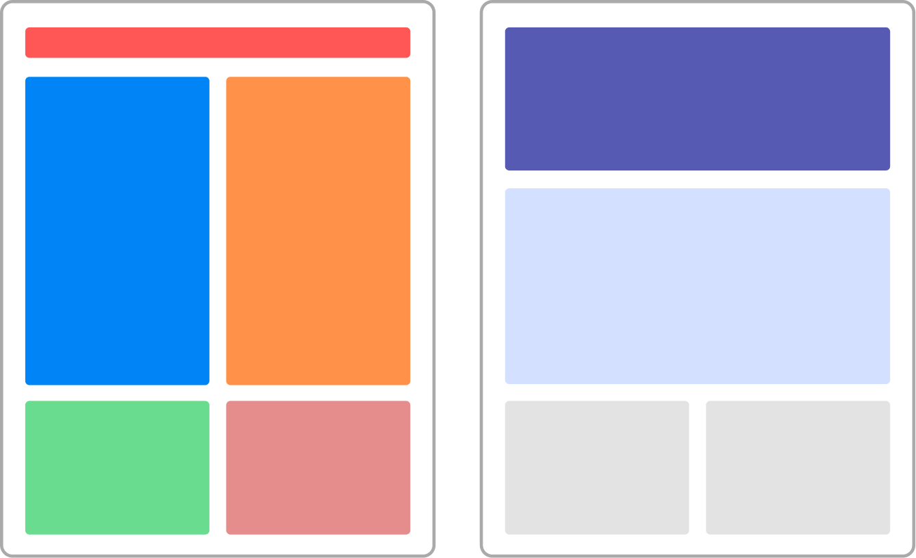
1. Edit the Color Palette
Using colors randomly in your design weakens visual hierarchy.
• Too many colors: Leads to visual clutter and a weak hierarchy.
• The 3-Color Rule: Keeping your palette limited creates a clear hierarchy and allows you to guide the viewer’s eye without tiring them.
2. Let Whitespace Support Color
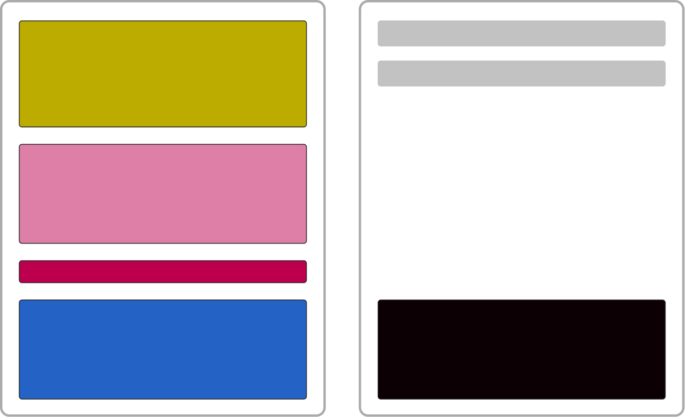
Space is one of the most valuable elements of design.
• Little space: Crowding elements makes perception difficult and creates a feeling of “overload”.
• Spacious Design: Whitespace allows your colors and content to “breathe”. It enhances the impact of your colors and makes the design appear more prestigious.
3. Use Accent Colors Sparingly
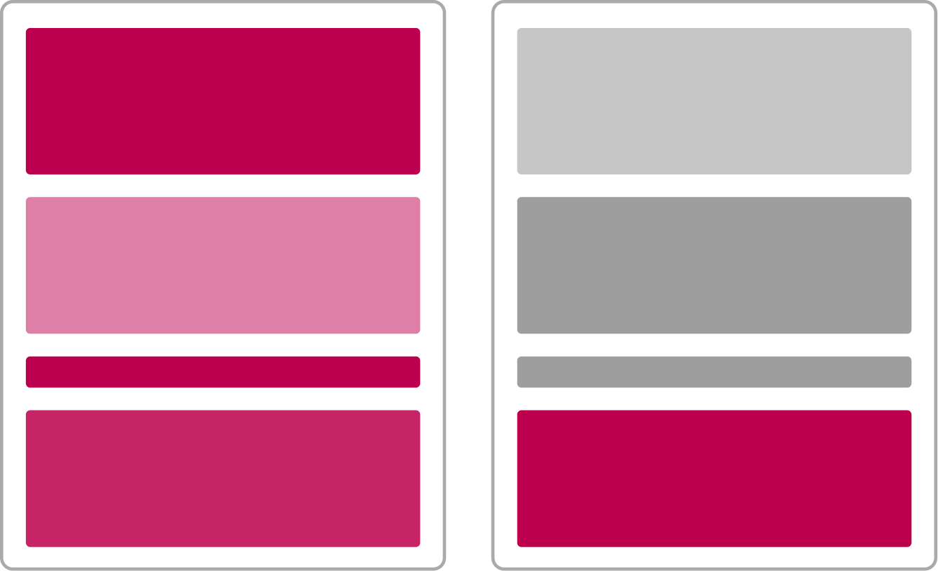
When an accent color is used everywhere, it ceases to be an “accent”.
• Everywhere: If the accent color is at every point of the design, it loses its focus and becomes “invisible”.
• Measured use: When you use accent colors only for calls to action (CTA) or very special details, you leave a memorable and impactful impression on the viewer’s mind.
Is Your Brand’s Visual Language “Premium”?
Design is a whole. The value perception in the viewer’s mind is shaped by the combination of small details. If you want to take your brand’s visual identity to a more professional, fluid, and impressive level, we at Kruv Agency are ready to assist you.