The Invisible Skeleton of Design: Grid Systems
The greatest secret behind a good design is often the sense of order that the viewer may not consciously see but certainly feels. At Kruv Agency, one of the most powerful tools we rely on when creating visual hierarchy and telling our stories is the use of Grid Systems.
What makes a design look “composed,” “professional,” and “fluid” is the order within the chaos — that is, grids. Here are some of the fundamental grid systems we frequently use from our design archive:
Grids That Shape Our Design Language
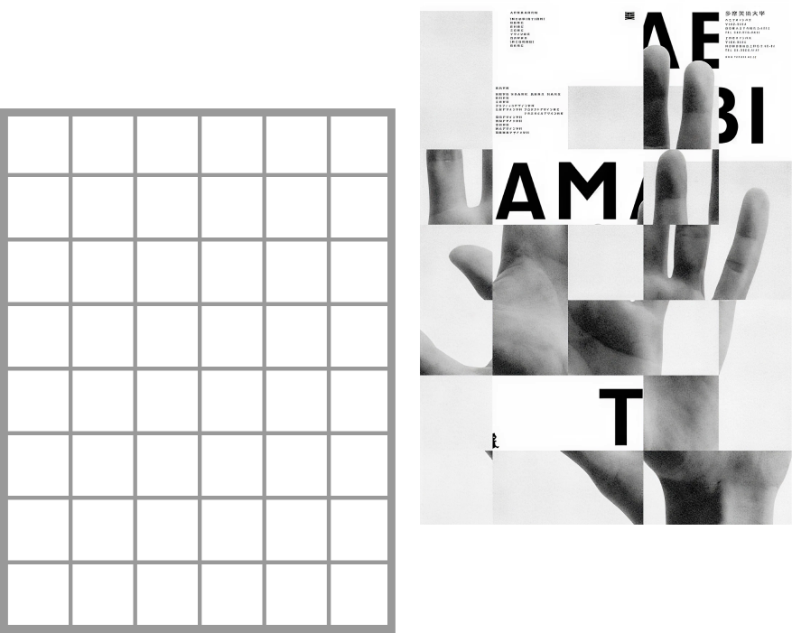
Modular Grid: Divides content into modules, offering both flexibility and a rigid structure. It is a perfect fit for complex editorial designs.
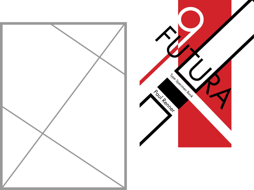
Axial Grid: Ideal for adding dynamism to a design and creating a strong visual flow by aligning elements around a specific axis.
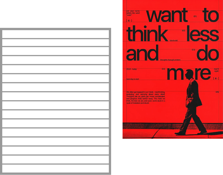
Baseline Grid: Adds perfect balance and readability to the entire design by anchoring the vertical rhythm of the text.
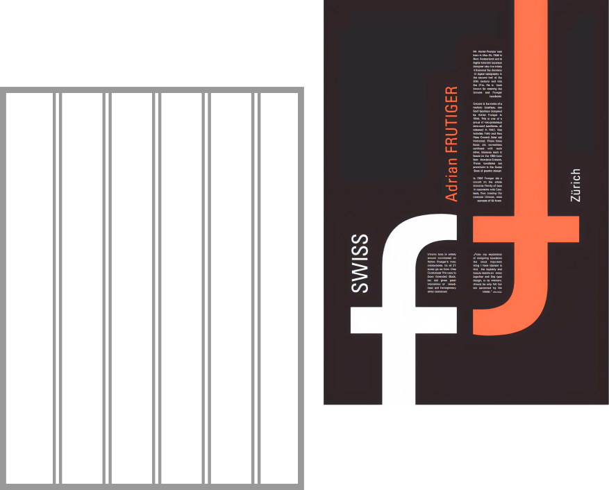
Column Grid: The essential tool for our projects where typographic balance and text readability are at the forefront.
Radial Grid: Used when we want to create a circular flow focused on the center, drawing attention to the focal point of the design.
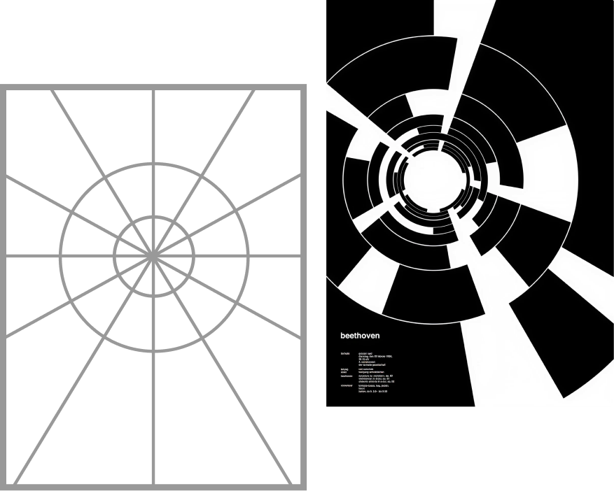
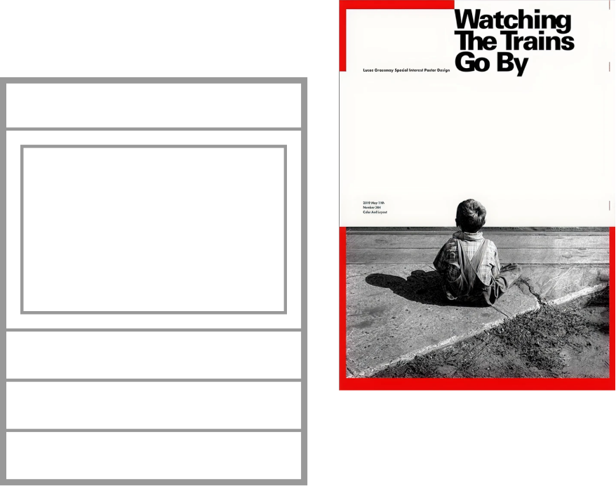
Hierarchical Grid: The most suitable structure for storytelling that we use to guide the reader’s eye along a path and present the most important information first.
Why Do We Use Grids?
Grid systems help brands maintain visual consistency in the digital world (social media and web). We transform a design from a collage of random pieces into a structure that inspires trust and a sense of professionalism in the viewer’s mind.
Whether we are laying the foundation for a newly established brand or updating the visual language of a growing one, grids are the skeleton that allows your story to be told in the most clear way.
If you want to build your visual identity on solid foundations and create a more discoverable brand, we at Kruv Agency are ready to assist you. You can visit kruv.com to browse our projects and get in touch with us.